01
01.
How to manage creative templates
When you’re getting creative requests from email, chat, or passing conversations, it’s hard to get a clear view of all the work that needs to be done, let alone prioritize and kick off that work quickly. So how do you keep your creative team focused and productive on the right tasks? This creative request template makes it easy to streamline your process for managing incoming requests, prioritizing and assigning work, and collecting feedback—all in one place.
- Centralize all incoming requests. Keep priorities clear and understand everything your team is working on by managing all incoming requests in the same tool.
- Collect the right details. Missing information—like creative requirements or design specs—can delay work. Use a form so requests are submitted with all the necessary details.
- Set clear expectations. For every request you receive, determine its priority level, assign it to someone, and set deadlines so everyone is on the same page about who’s creating what and when.
- Speed up the feedback cycle. Make approvals clear by tracking them alongside creative work and assets.
02
02.
Temeplates Design
Designers have a host of tools to help them create designs, but what about a tool to plan and manage the work to take it from brainstorm to approved? Without effective creative project management, teams lose time and productivity going back and forth on a creative brief or spin in circles on a feedback loop.
Instead, web, graphic, and product designers across agencies and companies can rely our creative project management template to start any project strong, and manage it to success with Asana.
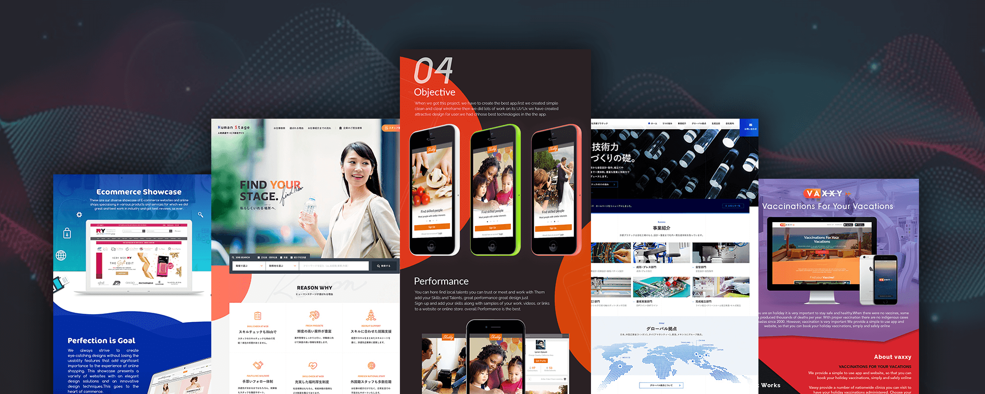
03
03.
What is Adaptive Design?
Similar to responsive design, adaptive websites also feature the ability to have your web content adjust accordingly to the viewer’s screen size. However, instead of having your content repositioned on every screen size, designers use a series of static templates based on different breakpoints in a page’s pixel width on a given device. Whenever a screen reaches a certain pixel width, it automatically adjusts to the next, smaller template until the device width reaches the next breakpoint, and so on.
Looking at the two styles side-by-side, it seems pretty clear that responsive design allows for more flexibility within a webpage. Whereas an adaptive site might only offer a few different layouts, a responsive design adjusts the content to nearly every change in screen size for an optimized layout. With all the different device sizes for mobile, tablets and desktop these days, it’s easy to see why it’s a better choice overall. Your content not only looks better, but is also easier to take in and understand.